You know that moment when you spin up a new project with Flux UI, and everything looks... perfectly fine? Clean. Professional. Default blue buttons everywhere. It works, sure, but it doesn't feel like yours.
Here's the thing we've learned after helping dozens of SaaS businesses build their interfaces: your brand shouldn't stop at the logo. Every button, every input field, every success message—they're all opportunities to make your users feel like they're in your world, not just another generic dashboard.
The "Good Enough" Trap
We've all been there. Launch is coming up, there's a mountain of features to build, and those default colors? They're... fine. They'll do. You'll come back to branding later.
Except "later" has a funny way of never arriving. Six months down the line, your SaaS still looks like everyone else's, and you're starting to wonder why your brand doesn't feel cohesive.
The irony? Making your interface truly yours doesn't have to be a massive undertaking. Not anymore.
One Variable, Infinite Personality
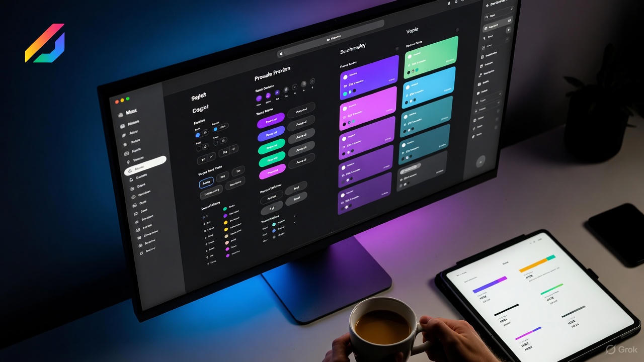
That's where Wirementpro Themes comes in. We've built something we wish we'd had years ago: a simple, visual way to try accent colors and grab the CSS variables you need for Flux UI.
Pick a color. See it live across components. Copy the variables. Paste them into your project. Done.
No messing with color theory. No wondering if your shades work together. No designer needed (though they're always welcome to fine-tune). Just real, working color schemes that you can implement in minutes.
Why Accent Colors Matter More Than You Think
Colors aren't just decoration. They're communication.
Your primary action button color tells users what's most important. Your success states reassure them they're on the right track. Your warning colors guide them away from mistakes. When these colors match your brand, your interface stops feeling like a tool and starts feeling like an experience.
We've seen businesses transform their user perception simply by moving from generic blue to their brand's signature color. Same features. Same functionality. Completely different feeling.
Built for Real Projects
Here's what we love about this approach: it's not theoretical. These aren't "50 shades of designer purple" that look amazing in isolation but fall apart in production. Each theme is built with Flux UI's component library in mind—buttons, forms, alerts, badges, all of it.
The CSS variables follow Flux UI's conventions, which means they work with dark mode, respect accessibility requirements, and play nicely with Tailwind CSS v4. You're not fighting your framework; you're extending it.
The Partnership Approach
This is exactly the kind of thing that fits our philosophy around Professional Services. We're not here to sell you a theme and disappear. We're here to help you build a SaaS that feels distinctly yours—whether that's through custom development, helping you extend these themes, or building entirely new design systems.
Your brand deserves to shine through your interface. Your users deserve an experience that feels cohesive and considered. And you deserve tools that make this easy, not exhausting.
Start With Color, Grow From There
The beautiful thing about starting with accent colors is that it's just the beginning. Once your base brand colors are working across your interface, you can build on that foundation—custom components, branded animations, unique interaction patterns.
But first? Pick a color that feels like you. Copy the variables. Make it your own.
Check out Wirementpro Themes and find the accent color that makes your SaaS feel like home.
Building something unique? Our Professional Services team specializes in custom Flux UI implementations, Filament integrations, and everything in between. Let's talk about making your SaaS truly yours.